Why input type date might not be ready for prime time yet?
Date Pickers
So, <input type='date'>. You think you’ve got a production-ready element you can just effortlessly drop into your site and call it a day?
If only it was that simple. Sometimes it is, but not always.
Why am I writing this blog post? My goal is to raise awareness about this element, particularly from an accessibility perspective, as it’s not always the best choice. I also want to highlight the built-in features of <input type="date">, as I’ve noticed some front-end developers on my team weren’t even aware they existed. I’ve also tested several other ready-made solutions for date pickers and date inputs, and I’ll be sharing insights from those experiences as well.
Before diving deeper, let’s take a look at the range of needs people have, especially those stemming from various disabilities and challenges. I’ll try and make this quick and short.
Types of disabilities and the people they affect
- Visually & hearing impaired
- Blind individuals who use screen readers and braille displays.
- People with low vision who rely on magnifiers, high contrast, or font adjustments.
- Color-blind users need sufficient contrast and text labels.
- For the deaf or hard of hearing, captions, transcripts, and visual alerts are essential to ensure accessibility.
- Cognitive, learning impaired & neurodivergent users
- For those with memory or attention issues, clear navigation and simple layouts are beneficial.
- For those with dyslexia or language disorders, using readable fonts and plain language can improve accessibility.
- For users with autism, consistent, straightforward designs, without overwhelming or flashing content are beneficial.
- Motor and physical impairment
- People with limited mobility may use adaptive devices like eye-trackers or switch systems, while those with tremors benefit from large touch targets and flexible interaction options to ensure ease of use.
As you can see there’s a huge spectrum of users here, some of which use keyboards, some of them use voice control, some of them use a switch device, eye tracking and so on.
What options do developers have to ensure date pickers are accessible?
Like the title says, the simplest way to go, is by using the native date picker. But hey, if that doesn’t work for you, you can always make your own custom solution or “borrow” an existing one.
It really depends on the situation where you need the date picker. Sometimes, it’s just easier to stick with basic input fields, why overcomplicated things, no?
Later, we’ll take a closer look at native date pickers, explore accessible ready-made (non-native) solutions, and chat about when simple input fields might actually be the smarter move.
The native date picker ?
Super easy to implement <input type='date'>
Great built-in features, such as:
- Automatic handling of date formats, like the USA’s
month/day/yearformat versus theday/month/yearformat used by the rest of the world (depends on browser). - Built-in internationalization that adapts based on your browser and operating system settings (you can see this in action in my YouTube video).
Some nice features out of the box here, this picker is somewhat accessible 🙂
So, what are the drawbacks?
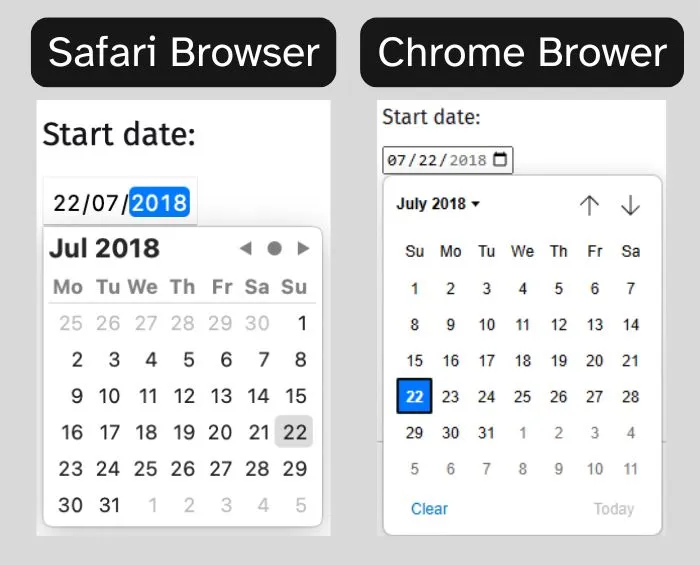
For starters, the date picker’s appearance varies across browsers, which means you lose consistency in design. Additionally, the output format is fixed to yyyy-mm-dd, and there’s no built-in way to change this, though you can, of course, always manipulate it with JavaScript
 Accessibility is of great importance, and although it works for the most part,
there are still some issues, especially with Safari browser. Additionally, there are a few missing “nice-to-haves”, such as the ability to announce the selected date.
Accessibility is of great importance, and although it works for the most part,
there are still some issues, especially with Safari browser. Additionally, there are a few missing “nice-to-haves”, such as the ability to announce the selected date.
I understand that achieving perfection is challenging, especially considering the variety of screen readers in use, and if you’re not familiar, here’s a list of some of the most widely used screen readers:
- JAWS
- NVDA
- VoiceOver
- Dolphin SuperNova
- ZoomText/Fusion
- Orca
- Narrator
I decided to run a little test, but I’m not here to impose a strict checklist for what a date picker must include, because it really depends on the specific needs of your project and your user base. That said, if you’re in Europe or USA don’t forget that accessibility is a big deal, you could face fines if you’re not compliant. So, make sure you’re covering the basics when it comes to accessibility.
Here are some super basic accessibility considerations for a date picker:
- Has to be accessible via keyboard
- Has to be accessible via mouse
- Has to be accessible via touch
- Can be used while zoomed in (magnification)
- For more details and ideas, you can check out APG’s Keyboard Support (opens new window) section
In the next section, we’ll do a quick comparison of how the date picker behaves across different browsers when using VoiceOver.
Browser Behavior with VoiceOver
Chrome with VoiceOver
Now, I know what you are thinking, Chrome and VoiceOver should not be combined as it’s not recommended. Ok, but if you look at the webaim survey (opens new window) for 2023-2024 it show’s about 2% of users that prefer this method.
Alright, let’s see the results:
- Wait, what is that being read? -3.3% ? what?
- After selecting a date, it focuses back on the pop-up button, which is great
- Wouldn’t it be helpful to have a confirmation for your selected date here? Some other date pickers include this feature, and it’s definitely one of those nice-to-have.
- Disabled dates are dimmed and cannot be navigated via keyboard on the picker itself.
- You can navigate the date picker using a keyboard, the voice feedback is quite snappy, unlike other date pickers that tend to skip dates if you are tabbing faster.
- It reads out the day of the week and the day of the month and the month, which is great info.
- Reads out the placeholder correctly.
Safari with VoiceOver.
- Erm.. What happened to the label? Safari ? Just ignored the label, swap it to
type=textand it works, but it does not liketype=date. - The look is very basic and it’s ugly… (I know, I know, opinions…)
- When using VoiceOver, the date picker doesn’t appear at all when you tab to the field (opinions…).
- Ok, placeholder, Safari uses today’s date as a placeholder. However, when using VoiceOver and tabbing between the fields, you hear 0 day, 0 month, and 0 year, even though the placeholder remains set to today’s date. This can be a bit confusing.
- Why put a date there when there’s no value selected ? Chrome has it as
mm/dd/yyyy(though this format depends on your OS and Browser settings).
- Why put a date there when there’s no value selected ? Chrome has it as
- Disabled dates are not dimmed… and you can navigate to them using the picker, (opinions…), then handle erroneous behavior with javaScript. Personally, I prefer how Chrome manages this by preventing choosing beyond the defined min-max dates altogether.
- Using the actual calendar picker, no mention of the month name or names of the weekdays.
- Once a date is selected using the picker, it is never re-announced.
- While using the stepper and if the picker is open, changing months does not reflect in the picker.
APG on Safari with VoiceOver
- Reads out the placeholder and values correctly
- You can focus on the picker itself, and it prompts you with “Change Date” followed by the currently selected date. This provides excellent feedback.
- It provides brief feedback “cursor keys can navigate dates”, which is another positive.
- While navigating thought the dates, you won’t get the names of the weekdays.
- This date picker lacks internationalization and localization (you’d have to implement that yourself).
- If you are tabbing thought dates really fast, some dates won’t be announced, I know I’m pushing it too far, but Chrome has solved this 🙂
- All in all, there are some useful accessibility features built in. However, it’s worth noting that this example is explicitly stated as not being production-ready.
UK JUSTICE on Safari with VoiceOver.
- Nice and clear, reads out the names of the weekdays, the month and the year on every date you jump on from the picker.
- After selecting a date the focus is put back on the button, and the current selected date is read out, again this is great.
- Disabled dates are read out as excluded date, unlike Safari’s native date picker, where you can navigate to anything and everything.
- I tried to put in some characters, and it looks like it send’s you back to today’s date.
- A little bit confusing, but if you focus on a disabled date, the select button does not have any action, but it’s not disabled either?
GOV.UK Design System on Safari with VoiceOver.
This is another interesting solution by using a <fieldset> element to help group a couple of inputs and labels. It’s a straightforward and effective approach, particularly suited for dates that users already know and can enter without needing a calendar, such as your birthday.
The GOV.UK Design System (opens new window) website offers a variety of use cases and best practices that you can borrow :)
Conclusion
The native <input type='date'> is a quick, efficient, and easy solution, provided you’re willing to accept its drawbacks, such as its unattractive appearance in Safari and the lack of certain features as discussed above.
But, on the other hand, it offers excellent flexibility for internationalization, localization, and can save a significant amount of time.
It’s especially effective if we sprinkle a little bit of JavaScript and CSS on top of it, to help us rectify some of these annoyances that we’ve seen. This could potentially make it the best option.
That said, every tool has its purpose, time, and place, depending on the problem we’re trying to solve. As we’ve seen, in some cases, we don’t even need a date picker, sometimes, a few simple input fields are all it takes to get the job done.